


Flexbox is amazing. It has changed how we write the CSS and it provides built-in support for responsiveness. So all the responsiveness of your website is handled by flexbox making it easier to create websites.
Flexbox is used for building one-dimensional layouts.
If you have used the Bootstrap framework for making responsive design, then you might be aware that, starting with Bootstrap version 4, it’s entirely based on Flexbox. Before Bootstrap version 4, it handled responsiveness using float properties but from version 4, the entire framework is re-written using Flexbox.
So knowing Flexbox is really an important thing because nowadays almost all websites are using flexbox functionality and it is an important part from the interview point of view also.
Want to learn Redux in detail and build a complete food ordering app? check out my Mastering Redux course. Following is the preview of the app, we'll be building in the course. It's a great project you can add to your portfolio/resume.
Note that, in this app, I have used INR as the currency for displaying the prices but you can easily change it to USD or AUD or any other currency with a single configuration change in the app.
Let's get started
Flexbox allows the elements on the page to grow and shrink based on the device width so we don’t need to write much CSS code to handle responsiveness.
To use Flexbox, the first thing you need to define is a flex container with display: flex property.
Take a look at the below layout:
As we know, div is a block element so each div is displayed on a separate line.
Here, the main div is the container that holds other divs. So we need to add the display: flex property to the parent main div container.
As you can see above, Just adding display: flex makes the child elements display side by side.
Let’s look at the properties available for the main container which holds the child elements.
flex-direction
By default, the direction in which elements are displayed is row so the below code:
.list {
  margin: 5px;
  padding: 5px;
  background-color: orange;
  display: flex;
}
is same as
.list {
  margin: 5px;
  padding: 5px;
  background-color: orange;
  display: flex;
  flex-direction: row;
}
The flex-direction property takes one of the following values.
row: This is the default value forflex-direction, so when we don’t specify anyflex-direction, it will berowby default.
row-reverse: It displays child elements in reverse order side by side.
column: It displays child elements one below the other.
colum-reverse: It displays child elements in reverse order one below the other.
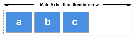
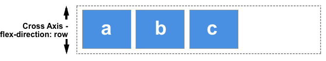
One thing to keep in mind is that, In Flexbox, how the elements are displayed is defined by main axis or cross axis.
Whenever we define flex-direction as row or row-reverse, the main axis runs horizontally and cross axis runs vertically.
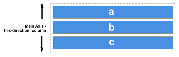
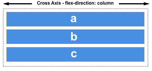
and when we define flex-direction as column or column-reverse, the main axis runs vertically and cross axis runs horizontally.
justify-content
justify-content defines where the elements will be displayed on the main axis.
When we don’t specify the flex-direction, it means it’s considered as row by default so the main axis is horizontal here.
The justify-content property takes the following values.
flex-start: This is the default value forjustify-content. So when we don’t specify this property,justify-contentvalue will beflex-start.
flex-end: It displays elements at the end of main axis.
center: It displays the elements in the center of the main axis. This property value is mostly used when we need to center content horizontally.
space-between: It will equally distribute the space between the middle elements except for the first and last element. This is the most widely used property value as compared to others
space-around: This will distribute the equal amount of space to the right and left of each element except the first and last element. For middle elements, space is twice when compared to the first or last element.
So if each element has 10% space on right and left respectively then number 2 will have 20% space on left because number 1 has 10% space on right and number 2 has 10% space on left so making it 10 + 10 = 20%. Similarly, on the right of number 2, space will also be 20%. Whereas left side of number 1 and the right side of number 3 will have 10% space.
space-evenly: This will equally distribute the space between each element. So every element will have equal space on the left and right sides.
The beauty of using Flexbox is that it makes the layout responsive without cutting the elements or adding a scrollbar as can be seen below

Even though we are resizing the browser window, the elements do not go out of the window or do not add scrollbar but they will adjust to the width of the device or web page.
So we don’t need to add a lot of extra code to make it responsive if we use Flexbox.
align-items
This property is used to align items across the cross axis.
The align-items property takes the following values.
stretch: This is the default value so if we don’t specify this property, thealign-itemsvalue will bestretch. It stretches the height of each element to be equal to the height of the tallest element.
As you can see here, we have not specified the flex-direction, so the main axis is horizontal and cross axis is vertical so even if we have specified the height of number 2 to be 250px but because of the default stretch value, all elements will have an equal height which is 250px and all the elements are stretched vertically.
As you can see here, we have specified the flex-direction as column so the main axis is vertical and cross axis is horizontal and align-items property is used to align the items across the cross axis, the elements are stretched horizontally.
flex-start: This will display the elements at the start of the area.
flex-end: This will display the elements at the end of the area.
center: It displays the elements in the center of the main axis. This property value is mostly used when we need to center content horizontally.
As you can see the elements are centered vertically because the cross axis is vertical.
As you can see the elements are centered horizontally because the cross axis is horizontal.
All the above flex properties like display, flex-direction, justify-content and align-items are added to the container which holds the child elements.
Now we will see the flex properties which are used for each flex element.
flex-wrap
The flex-wrap property allows us to move elements to the next row if it does not fit on the current row.
Take a look at the below layout which does not use flex-wrap property.
Now take a look at the below layout which uses the flex-wrap property.
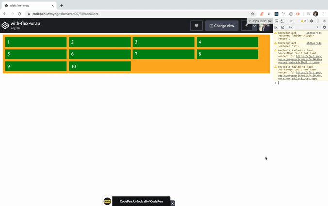
As you can see, each element is taking its allocated space and when we resize the browser windows the elements will move to the next row if there is not enough space for that element making it a good fit for responsive design.
order
The order property allows us to change the order of elements displayed in the flex container. The default order value is zero.
The element with the lowest order will be displayed on the left side and the element with the highest order will be displayed on the right side. The elements which do not have any order defined will have an order of zero.
Take a look at the below layout:
As can be seen in the above demo, an element with class first has order 3 and an element with the class third has order -2, the other elements will have order 0 so the highest order element will be displayed on right and the lowest order element will be displayed on left.
Adding order allows us to change the position of displayed elements on smaller width devices like mobile phones.
flex-grow
This property defines how the element will grow in relation to other elements. The default value of flex-grow is zero.
Take a look at the below layout:
As you can see, setting flex-grow to 1 for each element will allow that element to take the entire width that element has.
Let’s take a look at the below layout now:
As you can see, the first element has flex-grow of value 3 so it will grow 3 times compared to other.
flex-basis
It allows us to define the width of the element. The default value of flex-basis is auto.
As you can see here, just specifying flex-basis with a specific width, the first element will shrink when the screen size is smaller even though the width is set to 400px.
flex-shrink
It allows us to specify whether the element should be shrunk smaller than its actual width or not. It has a default value of 1 which means it can become smaller than its specified width.
Setting flex-shrink to 0 will not allow the element to shrink less than the specified width in the flex-basis property.
Instead of adding separate flex-grow, flex-shrink and flex-basis properties. It’s normal practice to use a shorthand property syntax so the below code:
flex: 0 0 250px
is same as
flex-grow: 0;
flex-shrink: 0;
flex-basis: 250px;
So now, we are done with flex properties for flex containers as well as flex items.
Now, we will take a look at some real use case.
Centering an element using flexbox
The justify-content and align-items property is mostly used to align an element at the center position.
As you can see by just using the display, justify-content and align-items properties, we can make an element centered aligned.
Note that, justify-content is used to align across the main axis and align-items is used to align across cross axis.
Live application using flexbox: https://flexbox-demo.netlify.app/
Try resizing the browser window in the above application and you will see that it’s adjusting to the width of the page making it responsive.
Thanks for reading!
That's it about this article.
You can find GitHub source code for the above application in this repository.
Check out my recently published Mastering Redux course.
In this course, you will learn:
- Basic and advanced Redux
- How to manage the complex state of array and objects
- How to use multiple reducers to manage complex redux state
- How to debug Redux application
- How to use Redux in React using react-redux library to make your app reactive.
- How to use redux-thunk library to handle async API calls and much more
and then finally we'll build a complete food ordering app from scratch with stripe integration for accepting payments and deploy it to the production.

Want to stay up to date with regular content regarding JavaScript, React, Node.js? Follow me on LinkedIn.